Slove

OVerview
Slove is an innovative Swedish startup designed to simplify the event booking process for musicians and venues. When I joined, user testing revealed several usability issues that were hindering user satisfaction and engagement. I led a complete redesign of the app’s information architecture, user flows, and interface, significantly enhancing its usability and functionality.
Impact
Simplified Booking: The new booking flow made the process faster and easier for users.
Better Usability: Restructuring the app and switching to vertical scrolling made it simpler to navigate.
Higher Engagement: Personalised recommendations and gamification encouraged users to engage more with the app.
Improved Visuals: The dark theme and brighter colours made the app look better and easier to use in low-light settings.
Smooth Development: Close teamwork with developers ensured the designs were practical and implemented successfully.
Design Process
While traditional UX design typically follows a linear process, my experience at Slove taught me the importance of flexibility. I adapted to the dynamic needs of our users by executing different design stages in parallel, ensuring that the app’s development could move swiftly and meet user demands.


Research
To gain a deeper understanding of our users’ challenges, I conducted interviews with musicians and venue owners. The findings highlighted the inefficiency of the booking process, which often took months to complete, frustrating users. Additionally, online surveys helped identify key user demographics, which informed the redesign. These insights were crucial in creating a more efficient and user-friendly app.
User Testing
Using existing app screens, I conducted online user tests that asked participants to perform tasks like messaging, booking, and profile updates. The feedback pinpointed significant usability issues and dissatisfaction with the app’s aesthetics, leading to targeted improvements that enhanced both the user experience and visual appeal.
Analysis and Planning
Working closely with developers, I identified and addressed the app’s most pressing issues. A key change was restructuring the information architecture to make essential features like messaging and event scheduling more accessible. This restructuring improved user navigation and overall app efficiency.
Wireframes & Testing
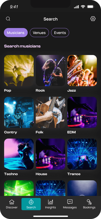
I developed wireframes that served as blueprints for the redesigned app. Through iterative user testing, these wireframes were continuously refined. For example, feedback led to a redesign of the Discover page, making it less cluttered and more visually focused, which improved user interaction.

Alterations
To improve navigation, I replaced horizontal swiping with vertical scrolling, aligning the app with common navigation patterns. The Discover page was simplified by reducing text and enlarging images, making the entire card interactive. This addressed user feedback and made the app more intuitive and accessible.


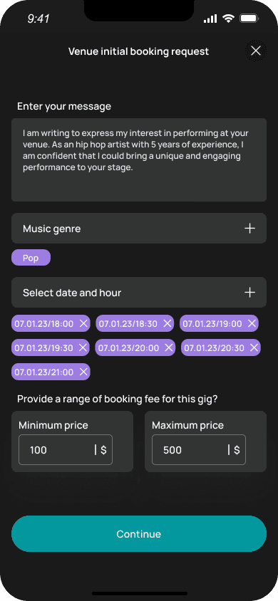
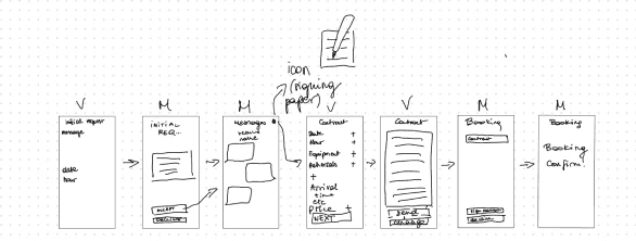
Booking Flow
The booking process was a major focus of the redesign. I developed a new, structured five-step flow that includes initiating contact, discussing event details, formalizing agreements, and creating ticketed events. This new flow not only improved user satisfaction but also enhanced the professionalism and reliability of the app, increasing user trust and engagement.
Retaining users
To boost user retention, we implemented features like personalised recommendations, which tailored gig suggestions to users’ preferences, gamification elements that rewarded users with points for booking gigs, and community-building efforts through email marketing and social media engagement. These strategies led to higher user satisfaction and increased repeat usage.
USer interface
I introduced a dark theme, which, combined with vibrant new colors, made the app more visually appealing and easier to navigate in low-light environments, a common setting for our users. This change improved user comfort and engagement during nighttime use.


Reflections
Seeing my designs come to life was both exhilarating and challenging. One significant lesson I learned was the importance of early and effective communication with the development team to ensure that design proposals were feasible within their technical constraints. For example, the original vision for the booking process had to be adjusted to align with the developers’ capabilities, ensuring a smooth and successful implementation.